Case study · Product design
Bonsai
A long-term product partnership shaping a greener payment experience for people across Belgium.
- Role
- Lead Product Designer
- Engagement
- 3+ years
- Location
- Antwerp
- Focus
- UI / UX & strategy
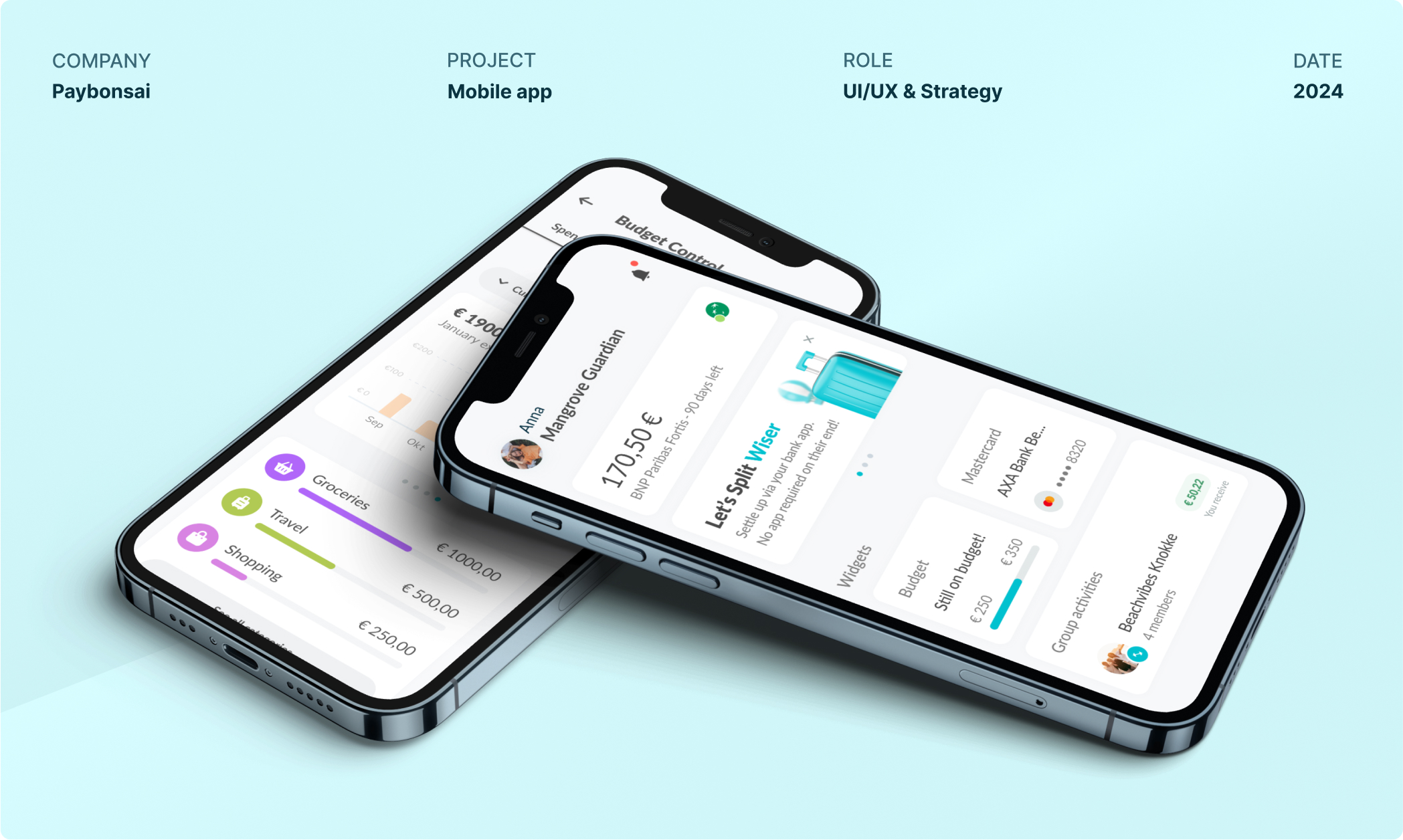
The partnership
Making everyday payments feel good—for people and the planet.
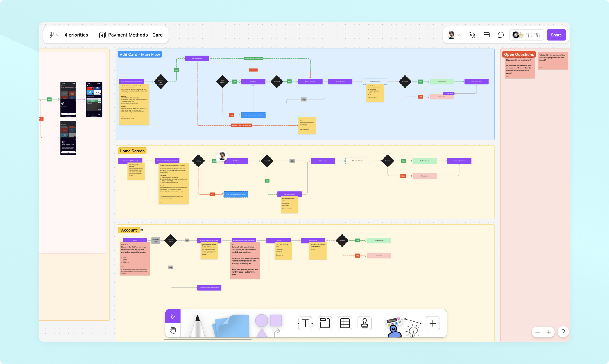
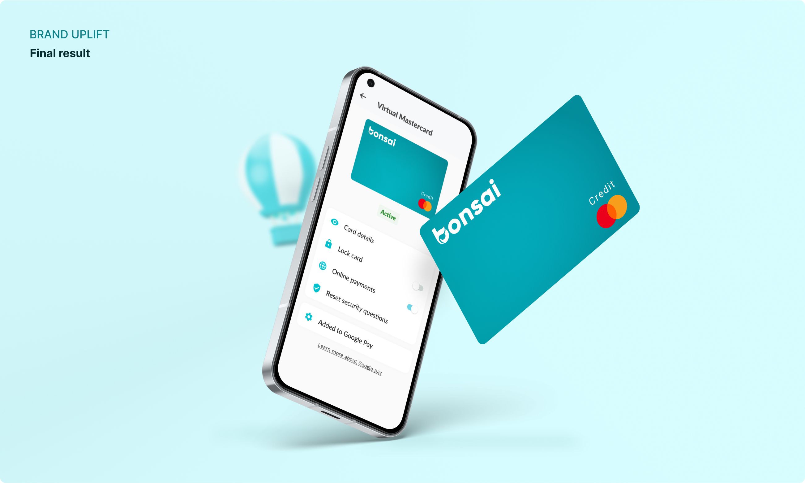
The work covered the full product experience: turning strategic questions into clear flows, testing interactions with real users and developing a visual language that could scale with the app.
Rather than presenting one giant redesign, these snapshots show how the experience evolved through focused, practical improvements across the product.
Selected UX
Small moments that make the product easier to understand.
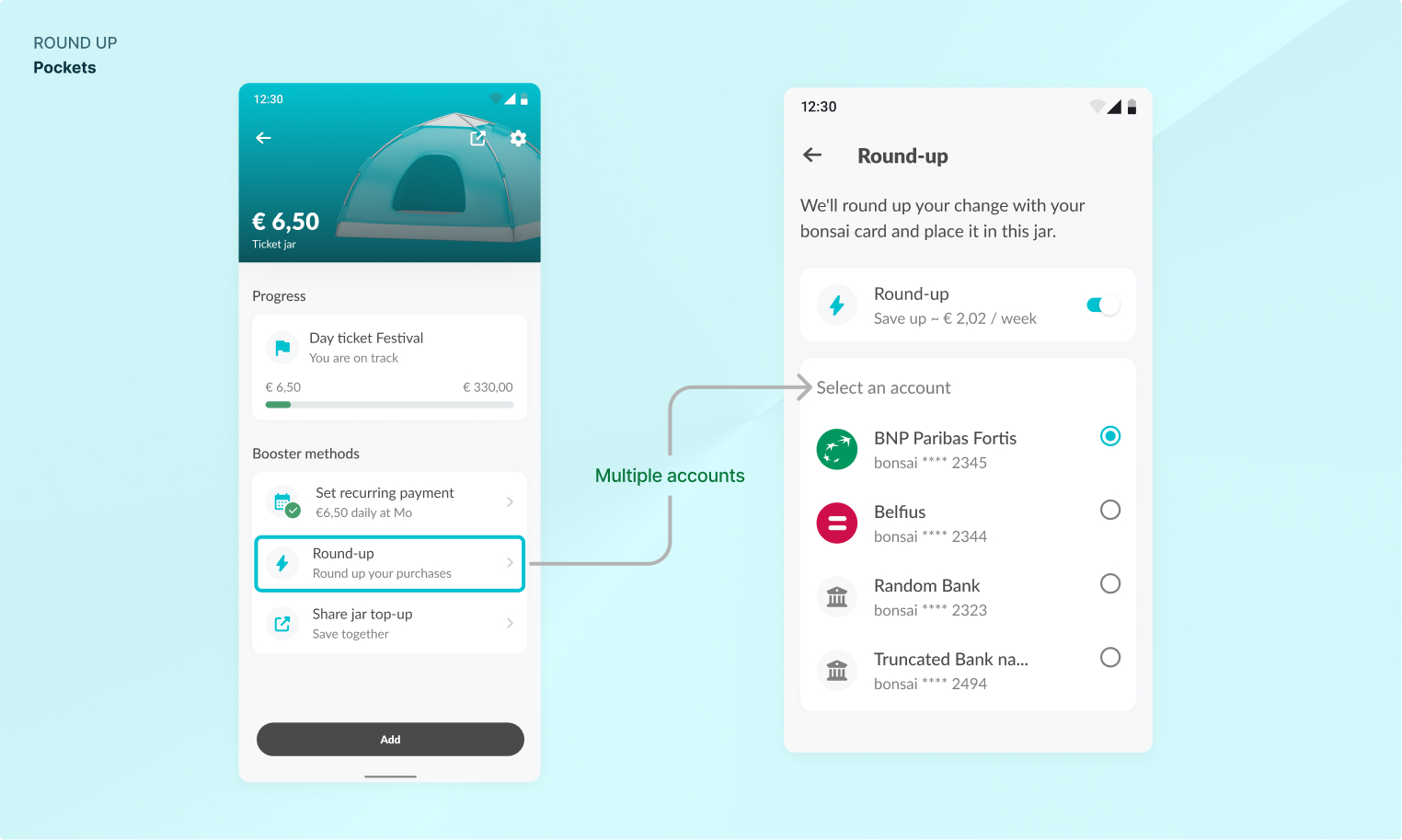
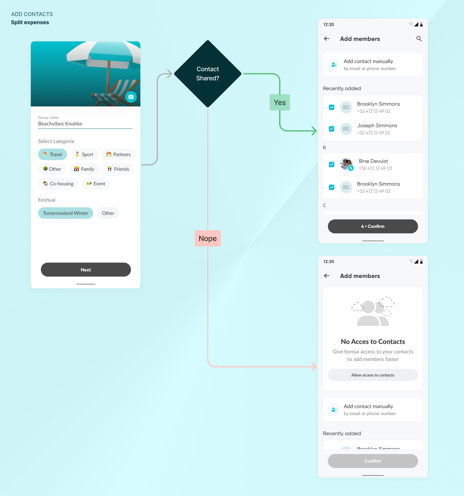
The most effective improvements often came from reducing the work a user had to do: making recurring actions discoverable, simplifying group payments and keeping social features close to the transaction.
Fraud prevention · Research & design
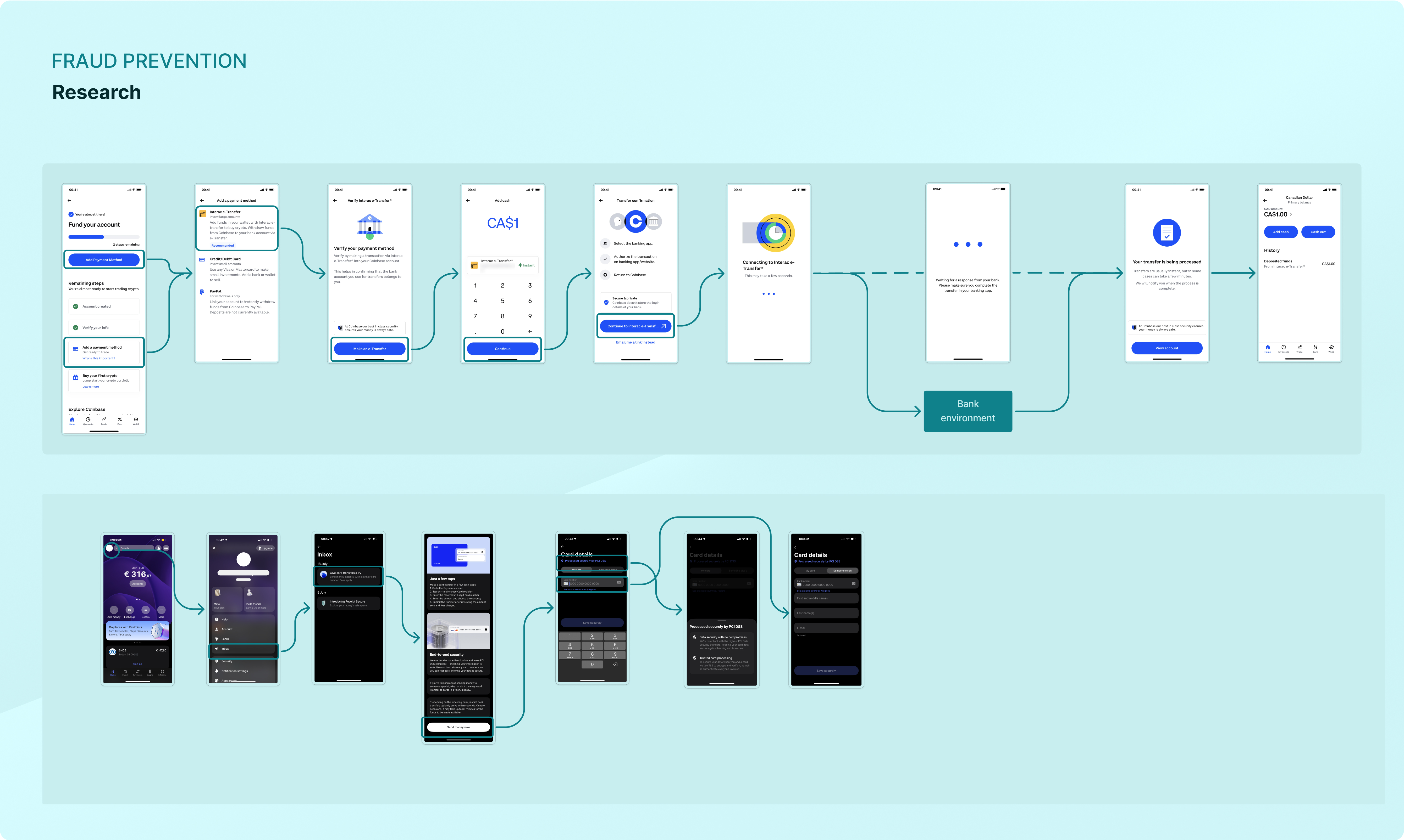
Moving from vulnerable direct debits to real-time verification.
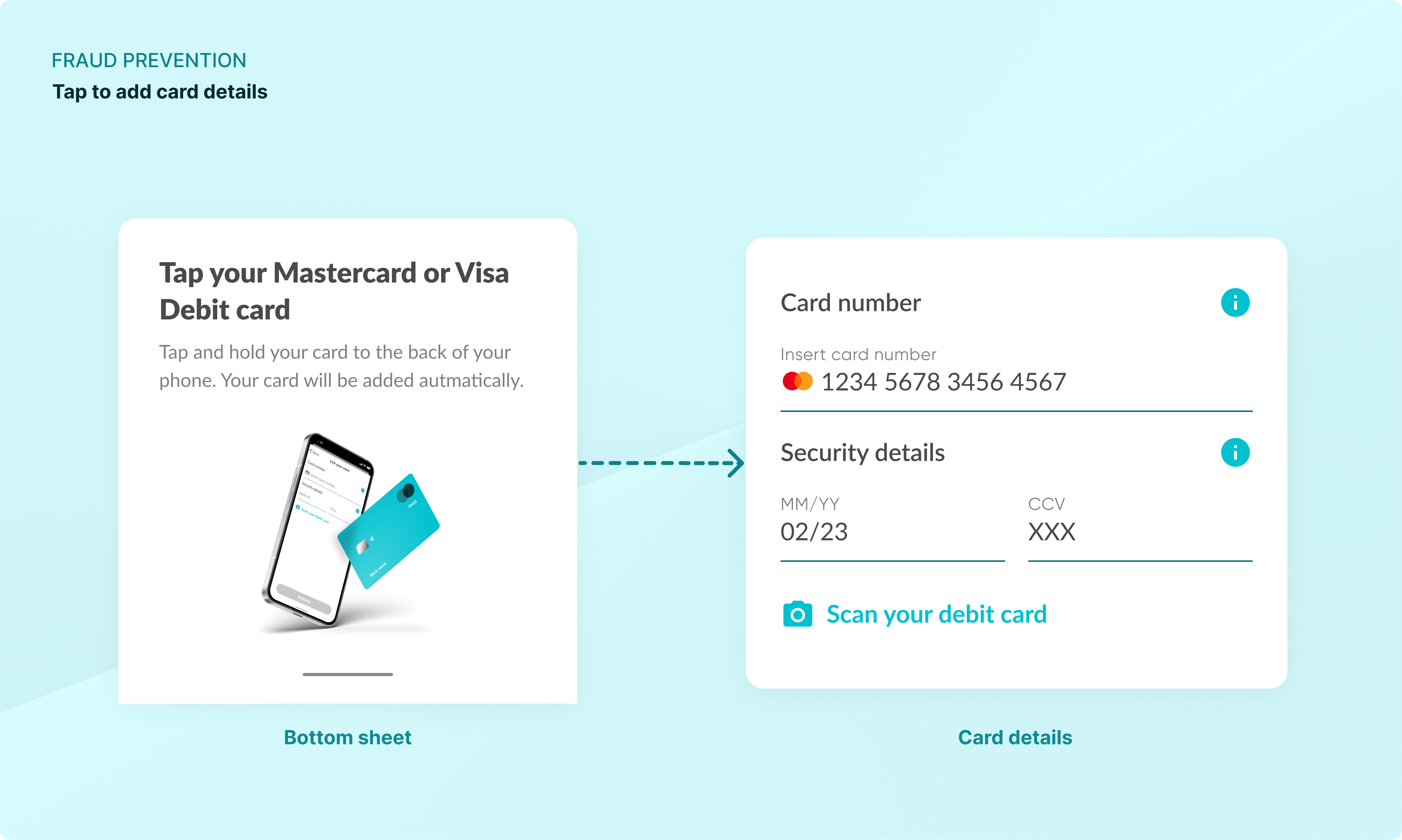
As Belgium transitioned from Maestro to Mastercard Debit, the team explored a more secure way to fund an account. The experience moved away from PSD2-based direct debits—where cancellation fraud can be a risk—towards linking Visa and Mastercard Debit cards to an existing account.
Problem 01
Adding a card after installing an app can feel like a chore.
Android's NFC tap feature was used to fill in card details automatically and remove repetitive manual input.
Problem 02
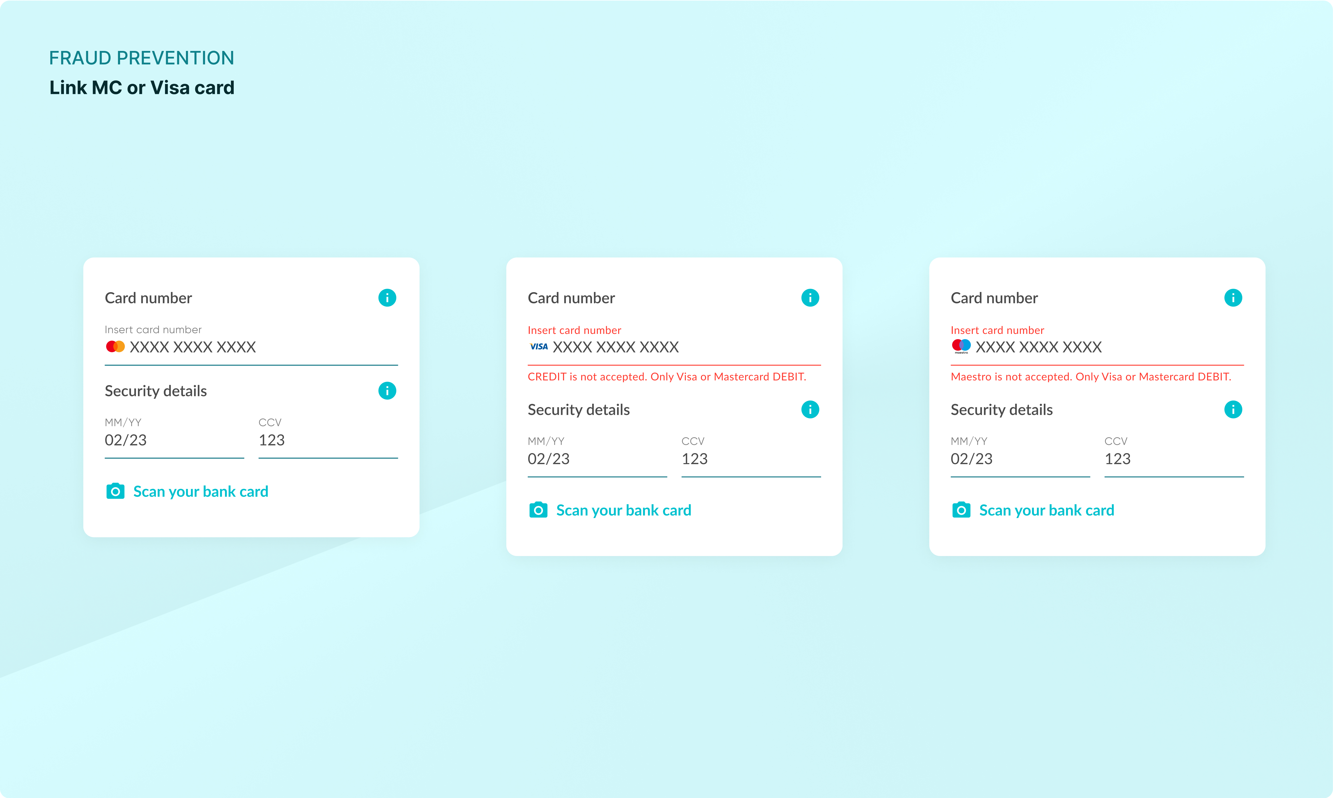
Debit and credit card types were easily confused.
Real-time UI feedback changes logos dynamically and pairs errors with clear explanations, helping users understand which cards are supported and why.
Accessible by design
A sustainable palette that still works for everyone.
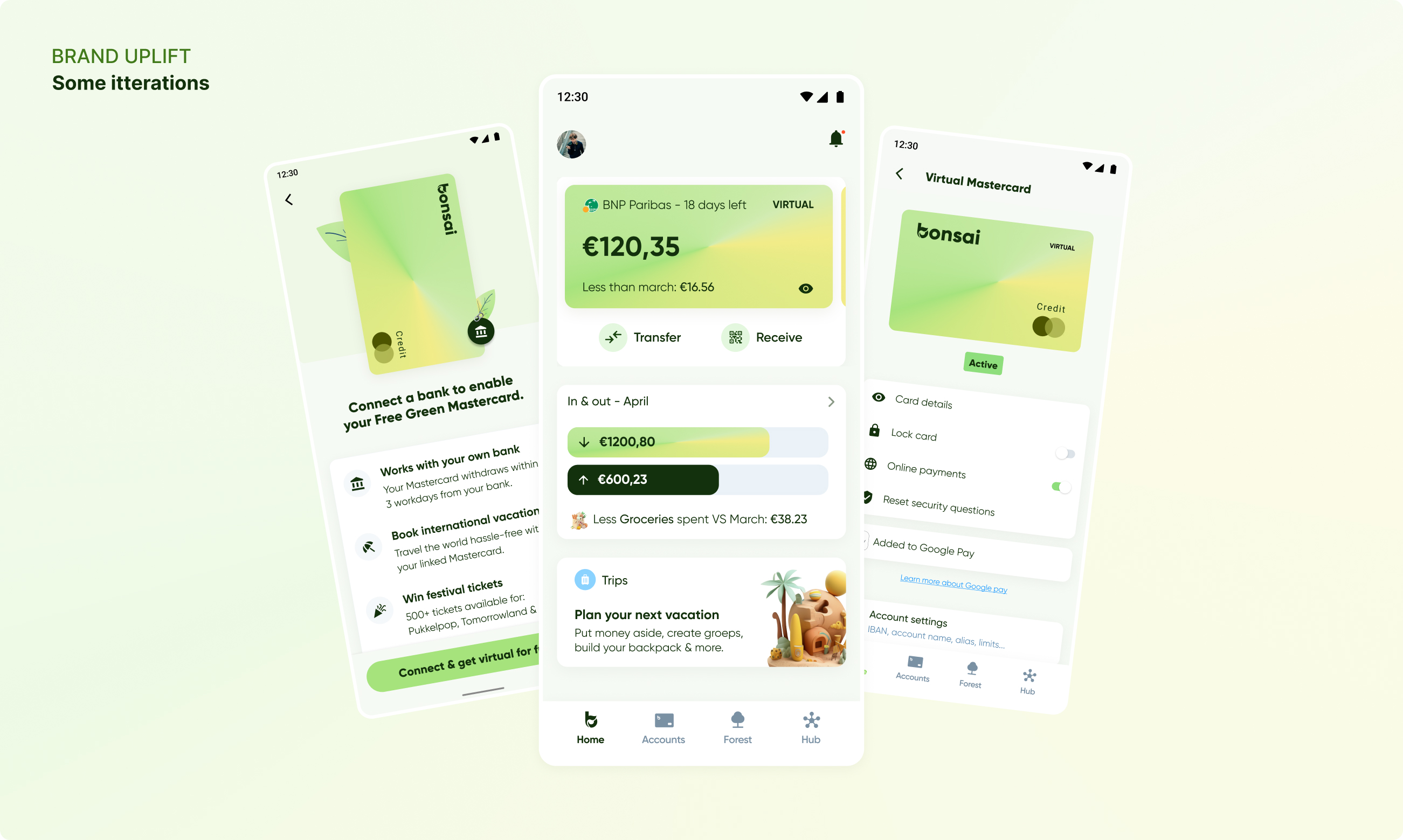
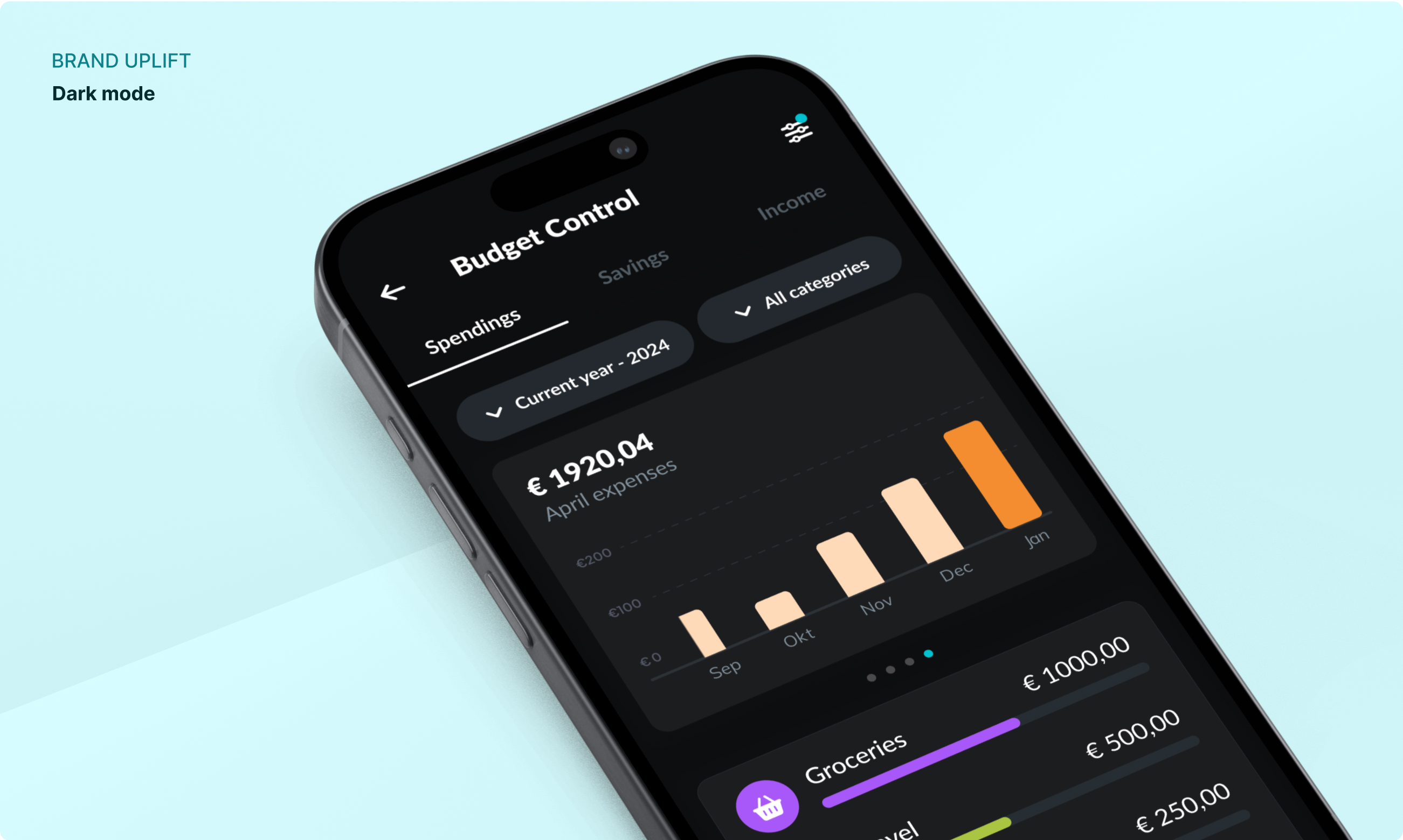
Because sustainability sits at the heart of Bonsai, shades of blue, turquoise and earth tones became an important part of the product language.
That direction introduced accessibility challenges. Contrast ratios and color combinations were refined against WCAG guidance so the system stayed expressive without becoming harder to use for people with visual impairments.
Collaboration
Designed together, tested with real people.
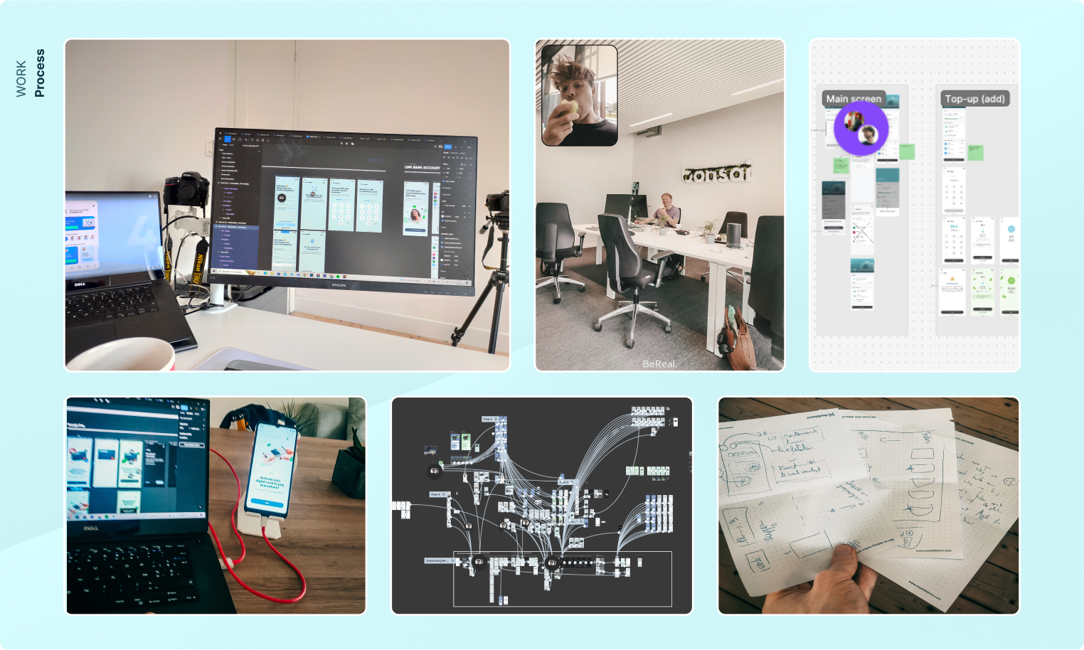
The work was a collaboration between Dieter Van den Hof, Jérémie Acquisto, the Bonsai team and the external testers who challenged and strengthened the product along the way.